Hey crafty friend!
I’m so excited to bring you this month’s sketch! This is my second sketch and I have had so much fun working with this sketch. Much like the first sketch, think about these shapes as place holders. I might use a circle where you used a heart or star or another shape.
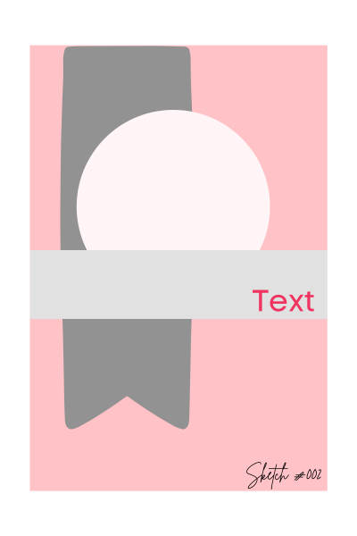
For this sketch I used a pattern paper piece to create the gray banner on the left side. But this might become the resting spot for your eyes when using a pattern paper as a background. I also tend to add solid color layers to help separate the elements.
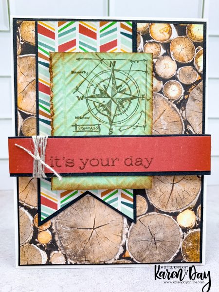
This is my first card with this sketch. It follows the sketch pretty closely. I did mix a bunch of different pattern papers so I used black cardstock to help separate the patterns. Since the background paper has all the wood cuts in a circle shape, I changed the large circle with a rectangle shape. Let’s look a little closer at the focal area.
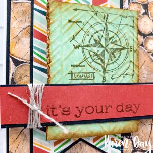
I started by stamping a Tim Holtz blueprint sketch stamp. Then I used a stencil and the embossing pad to emboss the stencil on to my stamped paper. I then took vintage photo distress ink and inked the edges and some of the raised areas. I really love the feeling of this card. But my second card has the opposite feel.
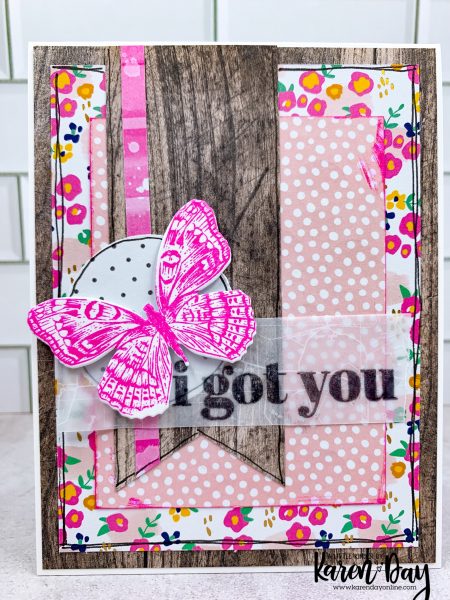
This card has all the same elements as the sketch, only I moved them or changed the layers. I played the natrual wood papers against a Stampin’ Up! paper that is very floral. The greeting is a Simon Says Stamp and CZ set. I love the fonts in this set and the messages are SPOT ON! Let’s take a closer look.
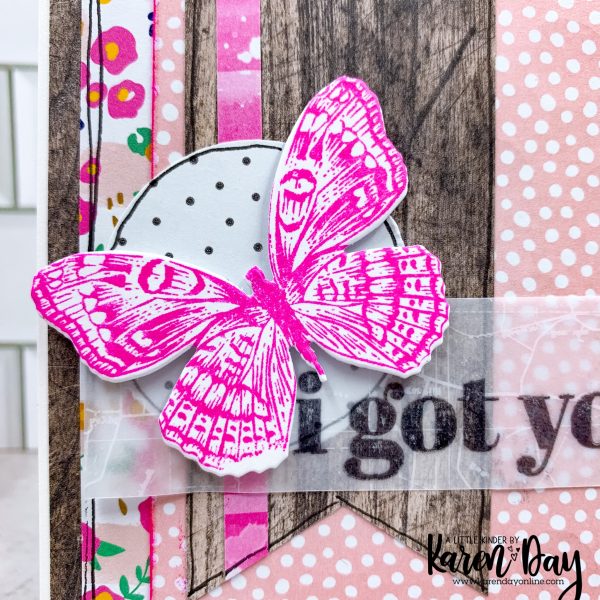
Here is that focal area. It has the flag shape, a circle, and the piece going across. I moved the circle to ground the butterfly and give the greeting a place to start. I also added an additional rectangle piece (the pink and white polka dot). I love how this one turned out!
I hope that you found this sketch inspiring! When you make cards using the sketch use #createdbykarensketch002 so I can see your beautiful cards!
Karen
